It’s hard to remember now but there was a time before business websites and social media profiles, before click-throughs and pop-ups. It was a time when the best way to tell someone about your business was in person, at your store, or on the phone, when you could explain all the important parts and then close the deal.
Your website now stands in for most, if not all, of these in-person interactions, and designing a website with user experience, or UX, in mind can determine whether you’re converting customers or letting opportunities slip by.
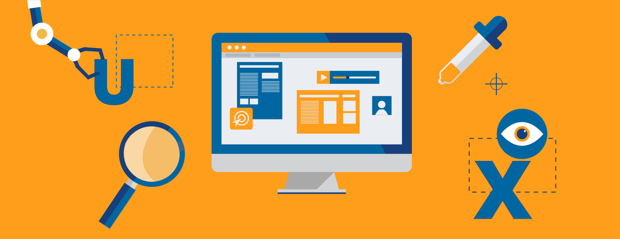
In short, UX is the overall experience for the person using your site, and how easy, intuitive, or pleasing it is to use. But UX is not just about the experience for your potential customer. It’s also about growing your business by guiding customers to behave the way you want them to behave on your site.
Below are some of the most important things to think about when designing and refining your site’s UX.
 What do you want them to do? What is a potential customer’s behavior when he or she lands on your site? Is it in line with what you want them to do? If not, how can you tweak your pages, menus, or messages to guide their behavior in the right direction?
Your site should include a clear “call to action” or CTA to get your visitor to do exactly what you want them to do (buy, donate, RSVP, sign up, etc.). A call to action is often highlighted in a different color or button, and its words should be as simple as possible. CTAs like “Buy Now,” “Sign Up,” “Donate,” “RSVP Today,” or “Learn More” all fit the bill.
Remember, your most valuable real estate is above the fold, or before any additional scrolling is necessary, so put your most important messages and your call to action up top.
If your site is already up and running, take a good, hard look at your Google Analytics to see where you’re losing people (in internet parlance, where they’re “bouncing”), so you can make informed decisions on how to tweak your UX.
 Design it well and keep it simple. Think about your favorite, easiest-to-use websites. What do they have in common? What do you like best? They’re likely using web fonts, which allow for the downloading of a brand-specific font while a site is being accessed, and they’ve limited font types and colors to no more than three. They’ve likely also offset the headers in larger type and kept body fonts to at least 16 point.
You can follow these same principles to make your site easy to read and easy to follow. Steer clear of light fonts on light backgrounds or overly embellished serif fonts, and don’t overload each page with too many images or too much copy. Choose clear, concise language to tell customers exactly who you are and what you want them to do.
 Be consistent. This goes for both design and messaging, both online and off. Each page of your site should be in line with your overall branding, and the colors, fonts, and wording should be consistent from page to page. There should be no doubt in a customer’s mind that your About Us page and your Contact page are part of the same website and business.
 Keep navigation standard. Your site’s navigation — those keywords with click-through on the top or sidebar of your site — is like the help desk of a brick and mortar storefront, and it should answer the questions a potential customer might have upon landing on your site for the first time. Who are you? What do you do? Where are you located? Why do you do it? And most important, what should I do now?
Over the years, the internet has more or less standardized this navigation language into sections like “About Us,” “What We Do,” “Contact,” and “Services.” Users have been trained to look for this type of language when seeking information on a site and there are few reasons, if any, to stray from these standard menu items.
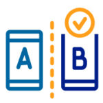 Testing, Testing, Testing. One of our favorite tools in our web designer toolbox is A/B testing, or changing a little part of your site for just a portion of your audience and seeing what happens. A/B testing usually involves changing a color, button placement, or CTA wording for some of your site visitors, and then assessing the results.
Does “Make a Difference” yield more donations than “Donate”? Does “Join Our Family” encourage more signups than plain old “Sign Up Now”? These tweaks could mean the difference between a record month and a sales slump, so don’t be afraid to test the most important parts of your site.
We believe that UX is the key to unlocking your business’s online potential, and that an intuitively designed site can help you stand out from your competitors.
And the best part about UX? As an internet user yourself, you likely already know a lot about what works and what doesn’t.